Introduction
Pink mailer boxes have moved from novelty to standing inventory for brands that sell to a largely female audience. In cosmetics, apparel, and subscription commerce, the color does real work: it announces the category before the lid comes off, and it photographs well enough that customers post it without being asked.
But a shade that looks right on a phone screen is not automatically a shade you can reproduce across twenty thousand boxes. Ink coverage, paper stock, coating, and flute profile all shift how pink reads on a doorstep or a retail shelf.
This guide covers the decisions that change your invoice and your unboxing photos. We will work through which pink holds on which material, how to specify size and closure, and how to keep the color consistent from the first sample to the final shipment.
Why Pink Mailer Boxes Perform
Pink forges an emotional association faster than almost any other packaging color. Soft blush reads as care and gentleness. Coral reads as energy and youth. Saturated magenta reads as confidence and edge. Pink is therefore not one decision but a family of them, and choosing the wrong end of that family can file your brand under the wrong category.
The practical advantage is contrast. A doorstep is a sea of brown corrugated and gray poly mailers. A pink box interrupts that pattern at the exact moment a customer is paying attention, which matters because delivery is often the first physical contact a buyer has with your brand after checkout.
Color also shortens recognition time on repeat purchases. A subscriber who has received three pink boxes identifies the package before reading the label. That reflex is the same mechanism behind consistent retail branding, and once the color is locked in it costs nothing extra to maintain.
One caution worth stating early: pink is a low-contrast field for fine type. Thin white logo marks and reversed-out small text frequently vanish on pale pink, both in print and in low-light delivery photos. If your design leans on detail, pair the pink with a darker accent or move the detail onto a white panel.
Where Pink Mailer Boxes Fit by Industry
Beauty and Skincare
This is the category where pink is closest to a default. Buyers expect soft, desaturated tones, and they judge the box against the product inside: a blush carton with a cool gray cast can make a warm-toned serum look tired. Ask for a press proof on the actual stock before approving the shade.
Subscription Boxes
Subscription kits live or die on the photograph a customer takes on arrival. A saturated coral holds up better than a pastel under phone-camera white balance, and a printed interior panel gives that shot a second surface to land on. Boxes that open flat and stay open are easier to photograph and easier to refill for returns.

Apparel and Accessories
Apparel buyers usually want the packaging to recede so the garment carries the moment. A muted pink interior, or pink outside with an unprinted kraft interior, keeps the box on-brand without competing with the product. This is also where pink pairs most often with unbleached brown kraft paper for a warmer, less candy-like result.
Health and Wellness
Wellness brands tend to use a deeper coral or dusty rose, partly to avoid reading as juvenile and partly because supplement and device buyers respond to calm rather than sweetness. Inserts matter here: a die-cut tray that holds pouches or vials upright prevents the rattling that customers read as cheapness.
Matching Paper Stock to the Pink You Want
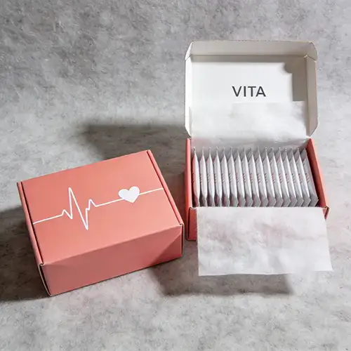
Pink behaves differently on every substrate, and the substrate decision usually gets made last when it should be made first. Corrugated takes ink into an absorbent surface; coated paperboard holds it on top. The same Pantone number can look two shades lighter on coated stock and noticeably duller on uncoated kraft.
| Stock | Protection | How pink reads | Best for |
|---|---|---|---|
| B-flute corrugated | High crush resistance | Muted, texture visible | Shipped single items, heavier goods |
| E-flute corrugated | Moderate, thin profile | Cleaner edges, flatter color | Retail-ready mailers |
| Coated paperboard | Low, needs an outer shipper | Brightest and most accurate | Kits packed inside another box |
| Kraft paperboard | Low | Warm, desaturated, visible fiber | Natural-positioning brands |
Two rules follow. If color accuracy is the priority, print on coated white paperboard and reserve corrugated for the structure that ships. If you are printing a large solid pink field on uncoated stock, expect the middle of the panel to run slightly darker than the edges, and approve a proof that shows the whole panel rather than a small swatch.
Board grades are standardized rather than proprietary, and the Fibre Box Association publishes the flute profiles and edge crush ratings that manufacturers quote against, which helps when you compare two suppliers.
Size, Style, and Closure
Pink mailer boxes are usually specified in one of three closures. The roll-end tuck top is the default e-commerce format: it folds flat, assembles in seconds, and needs no tape. A full-flap or flip-top style exposes more interior surface when opened, which suits photographed unboxings and gift sets. Buckle closures add a mechanical detail that reads as premium but slow down packing lines.
Size should be specified as an interior dimension, not an exterior one. Buyers who specify outside dimensions routinely receive boxes a few millimeters too tight for an insert, because board thickness and flute depth consume the difference.
| Typical interior size | Common contents | Note |
|---|---|---|
| Small, under 6 inches | Cosmetics, single accessory | Add an insert to stop movement in transit |
| Medium, 6 to 10 inches | Apparel, skincare sets, small electronics | Most quoted format; check insert clearance |
| Large, 10 to 14 inches | Multi-item kits, shoes, gift bundles | Consider B-flute for crush resistance |
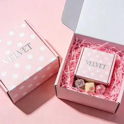
Standard formats cover most programs, and the full range of structures sits in our custom mailer boxes section, including the insert options that decide whether a kit arrives organized or rearranged. If pink is not your base color, the same structures run in other shades, and a blue mailer box built to the same spec is a useful comparison when you are testing color response with real customers.
Printing Pink Accurately
Pink is one of the harder colors to hold in four-color process printing, because the light tints that make a good blush are built from small percentages of magenta and yellow. A small registration shift on press is far more visible in a pale tint than in a dark, saturated one.
Where a brand color must be exact, specify a Pantone spot ink, or expand the ink palette to include it alongside process printing for photographic artwork and gradients. Matte lamination deepens and warms the pink; gloss pushes it brighter and shows fingerprints on dark surfaces.
The order of approvals matters more than the printing method. A digital proof confirms layout. A press proof on the final stock confirms color. Approving only the digital proof is the most common reason a delivery arrives looking like a different pink than the sample. Finishing options, from aqueous coating to foil stamping, are catalogued in our option library if you want to compare how each one behaves on a light-colored field.
Keeping Pink Packaging Sustainable
A bright pink box and a recyclable box are not in conflict. Two decisions carry most of the weight. The first is fiber sourcing: paper that carries FSC certification can be traced back to responsibly managed forests, and it is available in both kraft and coated white grades.
The second is the surface treatment. Heavy ink coverage and plastic film lamination are what complicate repulping. Water-based coatings, reduced ink coverage, and designs that leave a large unprinted area all make the box easier to recycle without changing how the pink reads.
The EPA's sustainable packaging guidance is a reasonable checklist if you need to defend a material choice to a retail buyer. Brands that want sustainability to be part of the message rather than a footnote usually pair the box with printed paper bags and inserts from the same material family, so the whole delivery can be described in one sentence, an approach covered in our guide to sustainable packaging.
What to Confirm Before You Order
Most purchase problems trace back to four details that were never written down: interior dimensions, board grade, closure style, and the approved color reference. Put all four in the purchase order, not in an email thread, because production reads documents rather than conversations.
Ask for the sample timeline before you finalize your own launch date. Structural samples confirm fit and assembly. Printed samples confirm color. Programs that skip the printed sample stage are the ones that discover a shade problem inside a full production run. For context on where the rest of the market is heading, industry press such as Packaging Digest is worth a periodic read, especially when a retailer you supply is revising its packaging requirements.
Conclusion
Pink mailer boxes earn their place when the color is treated as a specification rather than a preference. Decide the shade by category and audience, choose the stock you can actually print it on, and lock the reference with a press proof. Everything else — size, closure, inserts — belongs in the order as numbers, because that is what production reads.
Recyclability does not have to be sacrificed along the way. FSC-certified fiber, water-based coatings, and a design that leaves some paper unprinted will survive both a procurement review and a doorstep photo. If you are specifying a program now, send your requirements and we will come back with structure options and a color reference plan.
Frequently Asked Questions
What is the minimum order for custom pink mailer boxes?
Minimums depend on structure, board grade, and printing method, so the honest answer is that it varies by project. Simple structures in standard sizes usually start lower than fully custom die-lines with inserts. Tell us the size and quantity you are planning and we will confirm the minimum that applies to your specification.
Can you match a specific Pantone pink?
Yes. Supply the Pantone number and we print a press proof on the final stock before production. Matching a spot ink is far more reliable than reproducing a pink from a screenshot or a phone photo, because screens render light tints inconsistently and paper absorbs ink differently from an RGB display.
Are pink mailer boxes recyclable?
Paper-based mailer boxes are recyclable when the fiber is clean and the surface treatment does not include plastic film lamination. Water-based coatings, moderate ink coverage, and FSC-certified board all keep the box inside normal paper recycling streams. Removing any plastic tape or inserts before disposal helps as well.
What sizes do pink mailer boxes come in?
Anything from small cosmetics cartons to large multi-item kits. Sizes are built to your interior dimensions rather than chosen from a fixed list, which is why we ask for product dimensions and insert clearance instead of a standard size code. Board thickness is then selected to suit the weight being shipped.
How long does production take after I approve the artwork?
Timing depends on structure complexity, printing method, and finishing. Samples are typically ready within a few days, and the production window is quoted once the structure and print specification are locked. Confirm both dates in writing before you schedule a launch or a promotional drop.